
Why standing out matters when support matters most
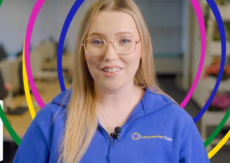
You may already have noticed the change. Our red has gone, replaced with a vivid blue. While our look has changed, who we are and why we exist has not.
Leukaemia Care news - 02 Feb 2026 - Leukaemia Care

Why we've changed our look, and what it means for you.
Something familiar.
Something new.
Something trusted.
Something blue.
You may already have noticed the change. Leukaemia Care’s red has gone, replaced with a warm, vivid blue. And we’ve launched a brand-new website making it easier to access our services quickly, and containing more leukaemia information than ever before.
While our look has changed, who we are and why we exist has not. In fact, quite the opposite.
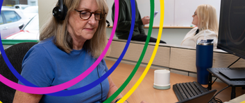
My name is Sophie, and I am the Patient Support Manager at Leukaemia Care. In 2018, I was diagnosed with acute lymphoblastic leukaemia (ALL). After successful, intensive treatment, including CAR-T immunotherapy, I went on to complete a Masters in Haematology. Today, I work here at Leukaemia Care, and I see first-hand the difference our services, because of your support, make to people every single day.
Living through leukaemia showed me that a diagnosis never affects just one person. It affects families and friends too, all of whom are trying to find clear, trustworthy information at a time when everything feels overwhelming. It also showed me how much care, time, expertise and thought it takes to make that information genuinely accessible and supportive.
Because I have lived this from both sides, I know how frightening leukaemia can be. I also know how important it is that information, support and reassurance are easy to find, easy to understand, and feel safe when you need them most.
That is why this change is all about accessibility, and why it matters.
For many years, our brand was red. At first glance, that made sense. Leukaemia is a blood cancer. But before making any changes, we asked a simple question: how does our brand make people feel?
We surveyed our own community and the wider general public. The answer was clear and consistent. Red wasn’t experienced as comfort. It was experienced as warning.
Red means stop. Red signals danger. It is the colour of warning labels, alarms and hazard signs. In nature, red is often used to say stay away. These are powerful signals, but they don’t match how we want people to feel when we want to be open for them to come to us for care and support.
Why blue and yellow
We chose colours that better reflect the support we provide.
Blue is calm and steady. It represents trust, reliability and connection. It is easier to read on screens and in print – hugely important in helping our information be more accessible at times when concentration can be hard. And in a space where many blood cancer organisations use red, blue helps Leukaemia Care stand out and reinforces us as a place of reassurance and support.
Yellow represents hope. It brings warmth and light, even in difficult moments. We use it carefully to guide people through information and highlight what matters most, without overwhelming or alarming.
Together, blue and yellow strike a balance. Calm and optimism. Reassurance and clarity.
You will also see circles in our new design. They reflect connection, continuity and care. They speak to the many ways people experience leukaemia, and the many ways we can be here for them, together through it all and surrounding them with support.
Making sure our message makes sense
This change is not only about those already living with leukaemia. It is also about how we are understood by the wider public.
We also need to stand out. The services we offer across the blood cancer world are often unique and tailored, and too important to be overlooked. If we blend into the background, people miss out on support that could make a real difference. Our new look helps us be seen, understood and remembered, so more people know what support is available and how to access it.
To support more people, we need more people to understand what we do. Public understanding also leads to donations, fundraising and long-term support. That support allows us to reach more patients and families, improve our services and be there at the moments that matter most.
A growing, accessible home for leukaemia information
We have put significant time, care and expertise into our new website, our information, and how accessible that information is. And there’s lots more to come.
We now have more leukaemia information built directly into webpages than ever before, with more being added all the time. Our ambition is clear: to become the largest dedicated leukaemia information resource in the world. That ambition is being built carefully, page by page and condition by condition.
Accessibility has been built in from the start. Tools such as Recite Me on our website allow people to listen to information out loud, change how text appears, or have content translated into the language suitable for them. We have chosen bold, readable fonts, generous white space and a design that reduces cognitive load, making it easier to focus when energy and concentration are limited. Further developments will follow as we continue to learn and improve.
This work has been shaped by real journeys. Patients and carers told us what they expect to find, what feels confusing, and what helps when they are tired, worried or overwhelmed. That insight is guiding how we grow the site and improve it over time.
Phasing things in
We have done this as carefully and responsibly as possible.
You will still see some red booklets and materials for a while. That is because they are still useful. We will not throw them away. Instead, we will replace materials with the new look when they need reprinting. This avoids waste and keeps more money focused on supporting people affected by leukaemia. This work to change how we are viewed has not been expensive, has not used the donations people make to us, and we are hugely grateful to the agencies and funders that have worked so generously with us on all of this.
It’s in our blood
For patients and families, that phrase reflects the reality that leukaemia is a cancer of the blood. That truth sits at the centre of everything we do.
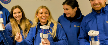
But it also speaks to our roots. Leukaemia Care was founded almost 60 years ago by people affected by leukaemia, sitting around a table and deciding that more support was needed. That spirit has never changed. To this day, people affected by the condition sit around our tables as colleagues and as our community, shaping our work and our future.
Care is in our blood. It shows up in every phone call we answer, every page of information we write, and every decision we make about how we support people better.
Our look may be new. Our commitment is not.
Thank you for being part of our community. I would love to know what you think of our new look and our growing, more accessible online home for vital leukaemia information.
And please continue to spread the word about our work and our need for support through donations, volunteering, feedback about our information and services, and so much more. We can’t do this without you.
Sophie
Patient Support Manager, Leukaemia Care
Related Topics
Six months of support: Our impact in 2025 so far
In the first half of 2025, Leukaemia Care has supported thousands through counselling, financial aid, …
Blinatumomab approved for acute lymphoblastic leukaemia (ALL) patients
NICE and the SMC have approved blinatumomab as a treatment option for B-cell acute lymphoblastic …
Obecabatagene autoleucel CAR-T approved by NICE: What you need to know
Obecabtagene autoleucel (obe-cel) has been approved as a treatment for adults with B cell acute …
Need help understanding this information?
Our support team is here to answer your questions and provide guidance.
Contact Support